Accessibility Guidelines
The Importance of Accessibility
POUR - Perceivable, Operable, Understandable, and Robust
Accessibility is a critical aspect of digital design. According to WCAG 2.0 (Web Content Accessibility Guidelines), there are four central principles of accessibility which state that content must be: Perceivable, Operable, Understandable, and Robust.
- Perceivable: Users must be able to perceive the content with one or more senses.
- Operable: Users must be able to interact with the interface, including things like buttons and navigation
- Understandable: Users must be able to understand what the content is in addition to how to navigate the user interface
- Robust: Users must be able to access the content even as assistive technologies and browsers, and other technologies evolve
To read more about WCAG, browse the WCAG 2.2 Guidelines.
Universal usability
Accessibility is more than just making sure users with disabilities can navigate and utilize something; it should be inclusive of all demographics and universally usable for both novice and expert users. Being able to effectively and easily browse content should be possible for everyone. Following standardized and widely accepted accessibility and usability principles is a great place to start to ensure your designs meet this expectation.
The following sections outline the ways in which functionality and accessibility can merge to achieve the most inclusive designs possible.
Color Contrast
It is estimated that globally, around 2.2 billion people have a near or distance vision impairment1, with at least 300 million people having some form of color blindness (mostly red-green) 2. This illustrates the importance of incorporating proper color contrast into designs and brand identity.
To view F&G’s brand colors in an expanded palette, as well as a tool to check color contrast with F&G colors, explore our expanded color palette, which includes a tool to test color contrast.
Another useful tool when working with color is WebAIM’s contrast checker which allows you to get the color contrast ratio of two colors.
Color isn’t everything
Accessibility includes considering multiple ways to understand part of an interface - designs shouldn’t stop with differentiating aspects of a website using only color. Adding labels, icons, or other context clues ensures that users will be able to perceive at least one or more elements in order to understand the content.
Alternative Text
What is alternative text?
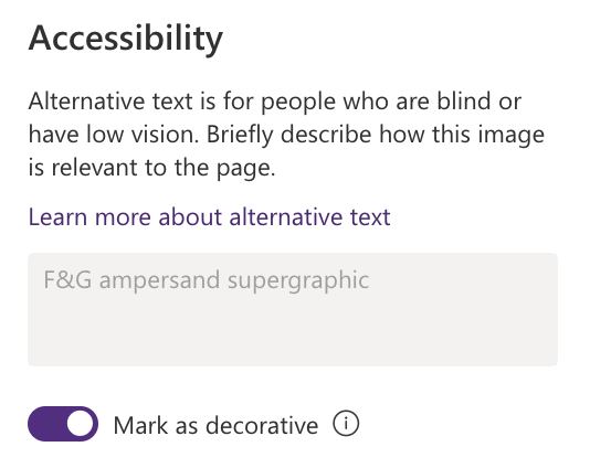
Also known shorthand as ‘alt text’, it describes the content of an image in an accurate but succinct manner. Images without any relevance to the content (i.e. decorative only), should be handled differently - a common implementation is to leave the alt attribute blank.
On a platform like SharePoint, there is an toggleable button within the Accesibility section in an image’s settings: “Mark as decorative”, which will fulfill this requirement.
At the end of this section you can find links to more information about different types of images and how to handle writing appropriate alt text for them.
Why does it matter?
According to webaim.org, there are three primary reasons for alt text to be included with images3:
- Screen readers: Screen readers announce alternative text in place of images, helping users with visual or certain cognitive disabilities perceive the content and function of the images
- Browser loading and configurations: If an image fails to load or the user has blocked images, the browser will present the alternative text visually in place of the image; this can increase usability for users with slow internet or security protocol that block images from loading
- Search engines/SEO: Search engines use alternative text and factor it into their assessment of the page purpose and content
Best practices
For images that require alternative text, there are a few best practices to follow:
Be succinct
- Avoid excessive wordiness in order to describe your image, ideally remaining under 125 characters (this is where many screen readers stop reading)
- If you require more context for the image, consider supplementing the alt text with a caption or link to some other content; however, typically avoid duplicating text already on a page within the alt text
- Put the most important information towards the beginning of the alt text description
Be accurate
- Avoid being so generic that accuracy is lost
- Be specific to the degree necessary for the context it is placed within
- Think about the ‘why’ of the image, as in why is it being included on the page? - the alt text should ideally provide that context to some degree
Beware of redundancy
- Typically, it is best to refrain from including such phrases as “a photo of…”, “an image of…”, “a graphic of…”
- Sighted users already understand that it’s an image, and screen readers will announce an image on a page
- However, DO say if it is a logo, illustration, painting, or other relevant artistic rendering
Punctuation is good
- Using punctuation helps with understandability, especially when being read out loud by a screen reader or other assistive technology
More resources for writing alt text
For more detailed information and examples, refer to the following links:
- An alt Decision Tree - follow this helpful yes/no question guide to determine what to include in the alt attribute
- What are Informative Images
- What are Decorative Images
Alt text Examples
Here are a handful of different examples of images and their alt text you can find throughout some of F&G’s digital content.

Alt: “Older woman in grey sweater”

Alt: “Des Moines skyline with purple buildings”

Alt: “A group of smiling professionals”

Alt: “F&G teammates volunteering at Meals for the Heartland”

Alt: “F&G aspirations logo”
*Note: for logos used as hyperlinks to landing pages/home pages (i.e. fglife.com), it is often best to simply write “F&G” as the alt text4.
Buttons and Calls to Action (CTAs)
Buttons are one of the most common components found in an interface and throughout the web - they are vital for a number of purposes, including functional purposes such as navigation, and desired user interactions such as contacting an organization or adding an item to a shopping cart.
A “Call to Action”, or CTA, can be understood as a primary desired user interaction often found near the top of a page, standing apart from other buttons or links on the page in it’s noticeability (i.e. color, size of text, etc.).
Effective calls to action
- Good calls to action give the reader a way to keep exploring or take quick action from their computer:
- Links to fglife.com or one of our microsites
- Links to trusted outside websites, such as industry associations
- Requests to take an immediate, non-time-consuming action (fill out a brief survey, watch a short video, register for a webinar)
- The number of calls to action will vary based on the context its placed within (landing page, email, etc.), but in general it’s best to have one primary call to action
- Any secondary calls to action should support the primary one - not pull reader attention away from it
How to write buttons and calls to action
| Do’s | Dont’s |
|---|---|
| Use clear and concise labels | Don’t use punctuation marks |
| Use sentence-case capitalization | Don’t use title case capitalization or all caps |
| Use active verbs or phrases for labels (i.e. delete or cancel) | Don’t use vague and generic labels (i.e. yes or no) or lead-in text such as “click the button” |
| Strive for short text within your button, generally 2-5 words | Avoid using long phrases that might wrap onto multiple lines, as these can be difficult to read on mobile devices |
Button placement and layout
- Primary button should always be first if buttons are stacked
- Window/section sizing:
- In a small window or card: Primary button should always be on the right if buttons are inline
- In a full page window or card: Primary button should always be on the left if buttons are inline
- If only using one button, use the filled primary button
- If using two buttons, use filled as the primary button and either outline (same color as filled) or text button for secondary
- If using three buttons, use filled as primary, outline as secondary, and text as tertiary (unless third button has same hierarchy, then can use two outline buttons)
Buttons vs. hyperlinks
Working with code
Understand the semantic difference between a <button> element and an <a> (anchor) element - a button generally performs an action or changes something on a page; an <a> element creates a hyperlink to anywhere that can be accessed with a URL, including other web pages, files, emails and more.
<a> elements can be styled to appear like a button, using CSS, as follows.
Learn More about F&G
They can also appear in the default in-line style, as follows.
Contact our team
How we use buttons
To learn more about how to style buttons with F&G brand colors and different use cases and examples, explore our section dedicated to button components.